Scrapbook Color Palettes: How to Choose Colors for a Page
Pick three or four colors from your photos, use the color wheel to find partners and decide how much of each belongs on the page.
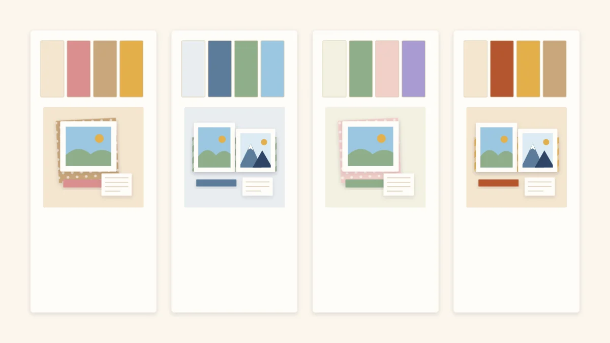
Good scrapbook color palettes are small. Three or four colors, used in unequal amounts, are enough for almost any page: a neutral for the background, one main color, one accent, and sometimes a second supporting shade. The difficulty is rarely finding colors you like. It is choosing so few of them and deciding how much of each to use.
A palette has one job, which is to make the photos easier to look at. Paper that is brighter or busier than the pictures pulls attention away from them, so every choice below starts from the photos and works outward.
Start with the photos
Spread the photos for the page on a white surface and look for the colors that repeat: the blue of a sky, the green of a lawn, a red jacket that appears in three shots. Pick one of those as your main color. Paper in that color will look as if it belongs with the pictures, because part of it is already in them.
Then check how strong the photos are. Bright, saturated photos can stand next to strong paper colors. Soft, pale or faded photos are overwhelmed by them and need muted or lighter paper. If the photos have no color in common, or the colors clash with each other, printing copies in black and white lets you use any palette you like.
Use the color wheel to find partners
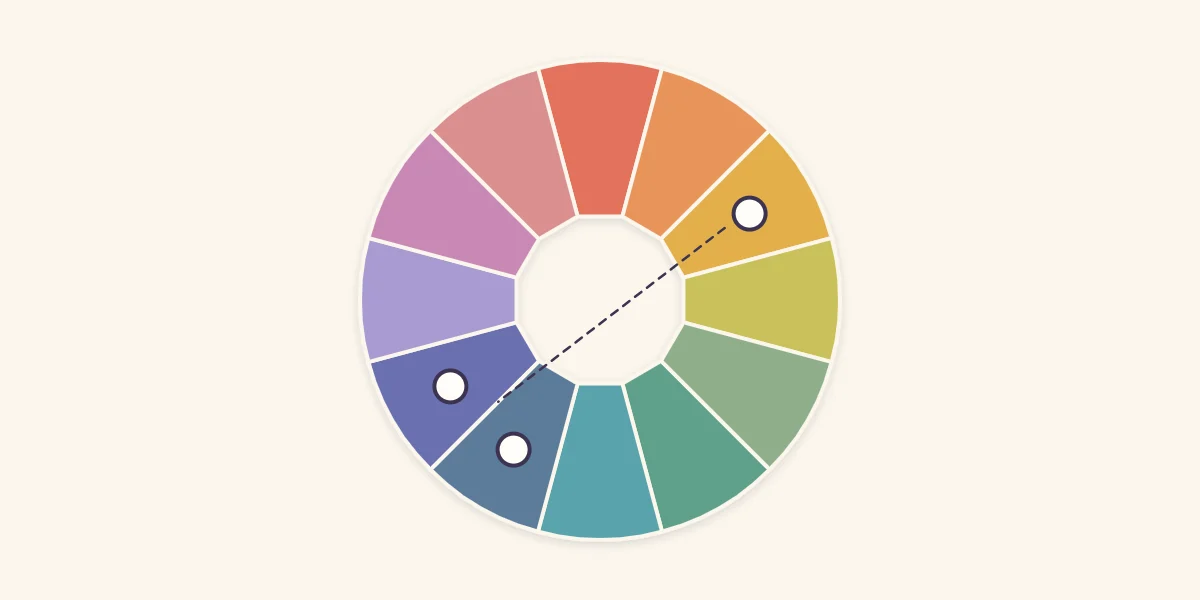
A color wheel arranges hues in a circle, usually in twelve segments, so that related colors sit next to each other and contrasting colors sit across from each other. You only need three relationships:
- Neighbors. Two or three colors that touch on the wheel, such as blue and blue-green, blend quietly and rarely go wrong.
- Opposites. Colors directly across the wheel, such as blue and orange, make each other look brighter. Use one in a small amount.
- Neighbors plus an opposite. Two neighboring colors for most of the page and the color across from them as a small accent. This gives harmony with one point of contrast, and it is the most useful formula for a scrapbook page.
Hold paper chips against the photos rather than trusting the wheel alone. The wheel tells you which hues relate; it says nothing about whether a particular sheet is too dark or too bright for your pictures.
Common palette types
| Palette | How it is built | Effect on the page |
|---|---|---|
| One color in several shades | Light, medium and dark versions of a single hue | Calm and unified; can look flat without a neutral |
| Neighbors | Two or three colors side by side on the wheel | Soft and blended |
| Opposites | Two colors across the wheel from each other | Lively; tiring if both are used in equal amounts |
| Neighbors plus an opposite | Two neighbors and one accent from across the wheel | Harmonious with a clear focal accent |
| Neutrals plus one color | Cream, kraft, gray or white with a single color | Quiet; suits busy or mismatched photos |
Decide how much of each color
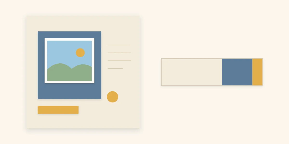
Equal amounts of three colors produce a striped, restless page with no obvious place to look. Unequal amounts create order. A reliable starting point is roughly six parts neutral, three parts main color and one part accent.
In practice that means the neutral is the background cardstock, the main color appears in a large paper block, mats or a wide strip, and the accent shows up only in small things: a thin mat edge, a few embellishments, part of the title. Because the accent is the brightest and rarest color, the eye goes to it first, so place it near the focal photo. The reasoning behind that placement is covered in the guide to focal points and balance.
Let neutrals do the heavy lifting
Cream, white, kraft, gray and black count as neutrals. They take up space without adding another color to manage, which is why most pages look better with a neutral background than a colored one. White and cream make colors look clean and light. Kraft warms them and suits outdoor and travel photos. Black and dark gray make bright colors glow but can feel heavy.
Finish and texture change how a color reads as well. A textured sheet looks slightly darker and softer than a smooth one in the same shade; the guide to cardstock weights and finishes explains the differences.
Tip
Judge patterned paper from across the room. From a distance a pattern blends into one overall color, and that blended color is the one that has to fit your palette.
Match the mood, not the theme
Palettes carry a mood before any embellishment is added. Warm colors such as coral, mustard and rust feel energetic and close. Cool colors such as denim, sage and lilac feel calm and distant.
Choosing by mood gives better results than choosing by theme. A page about a snowy day does not have to be blue, and a birthday page does not have to use every bright color at once. For palettes built around the time of year, see the examples in seasonal scrapbook layouts.
Test a palette before you cut
- Lay the background cardstock flat and place the photos on it.
- Add the main-color paper as a folded sheet or a large offcut, without gluing.
- Drop a small piece of the accent color next to the focal photo.
- Step back. If the paper is the first thing you notice, swap it for a quieter shade.
- Remove one color and see whether the page looks better without it.
Small offcuts are ideal for this kind of testing; these paper scrap ideas cover sorting and using them.
Signs a palette is not working
Watch out
If the page feels busy but you cannot say why, count the colors. Patterned papers often bring two or three extra colors with them, and a planned palette of three can quietly become seven.
Other warning signs are photos that look dull next to the paper, which means the paper is too saturated, and a page where nothing stands out, which usually means every color is the same strength. Swap one sheet for a much lighter or much darker version and the contrast returns.
Frequently asked questions
How many colors should a scrapbook page have?
Three or four is enough for most pages: a neutral, a main color, an accent and sometimes one supporting shade. More than that tends to compete with the photos. Remember that patterned paper can add extra colors, so count those too.
What background color works with most photos?
Neutrals such as white, cream, kraft and gray work with nearly any photo because they do not add a competing color. White and cream keep a page light, kraft adds warmth, and dark neutrals make bright colors stand out but can feel heavy.
What should you do when the photos clash with each other?
Print copies in black and white, or choose a palette of neutrals plus one color. Both approaches remove the color conflict between the photos and let a single paper color tie the page together.