Scrapbook Page Composition: Focal Points, Balance, and White Space
A focal point, the rule of thirds, balanced visual weight, a triangle of repeated elements and deliberate empty space: the checks that make a layout easy to read.

Scrapbook page composition is the set of decisions about where things go and how much room they get. It explains why two pages made from the same photos and papers can look completely different: one settled and easy to read, the other restless. Four ideas do most of the work, namely a focal point, balance, repetition in a triangle, and white space.
None of these is a rule that must be obeyed. They are checks you can run on a dry arrangement before the adhesive comes out, and each one has a visible symptom when it is missing.
Give the page one focal point
A focal point is the place the eye goes first. On most layouts it should be a single focal photo. When every photo is the same size and treated the same way, the viewer has no entry point and the page reads as a collection instead of a story.
You can make one photo dominant in several ways, and combining two is usually enough:
- Size. Make it clearly larger than the others, not slightly larger.
- Mat. Give it a wider or double mat while the supporting photos get thin mats or none.
- Contrast. Place it on the lightest or darkest paper on the page.
- Isolation. Leave more empty cardstock around it than around anything else.
- Decoration. Put the main embellishment cluster against it.
What going wrong looks like: your eye jumps between two or three spots and settles on none. The fix is to shrink or remove a competitor, not to add more to the intended focal photo.
Place the focal photo using the rule of thirds
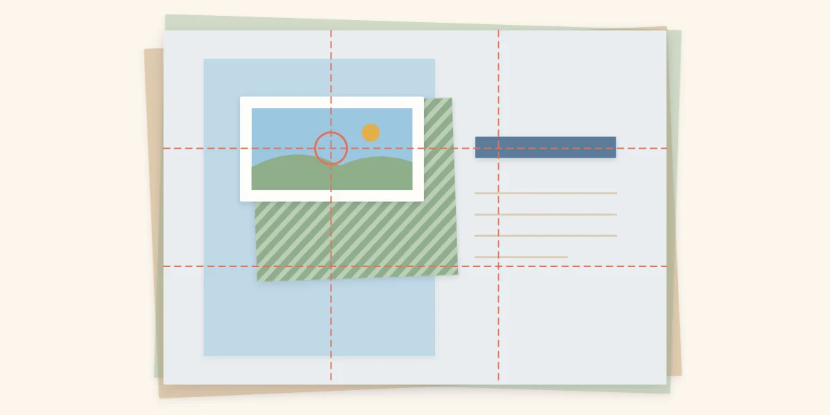
Dead center is the most static position on a page. The rule of thirds offers four livelier ones. Imagine two vertical and two horizontal lines dividing the page into nine equal parts. The four points where those lines cross are natural resting places for the eye, and a focal photo centered on one of them looks deliberate without looking stiff.
On a 12 x 12 in (30.5 x 30.5 cm) page the lines fall 4 in (about 10 cm) and 8 in (about 20 cm) from each edge. You do not need to draw them: lay two strips of scrap paper across the page as temporary guides, position the photo, then remove the strips.
Balance the visual weight
Every element has visual weight. Large, dark, bright, patterned or detailed pieces feel heavy; small, pale and plain ones feel light. A balanced page distributes that weight so no side seems to sink.
Symmetrical balance mirrors the two halves: a photo on each side, a centered title. It is calm and formal, and easy to get right. Asymmetrical balance sets one heavy element against several lighter ones, such as a large photo on the left answered by a title, a journaling block and a small cluster on the right. It is more dynamic and takes more adjusting.
A quick test is to squint at the arrangement until details blur. If the dark masses all sit on one side or along the bottom, shift a mat, a strip of strong color or the title across to the lighter side. Color contributes to weight as much as size does, which is why choosing a palette and composing a page are closely tied. On a spread, judge balance across both pages together, as explained in designing two-page layouts.
Use a visual triangle for repeated elements
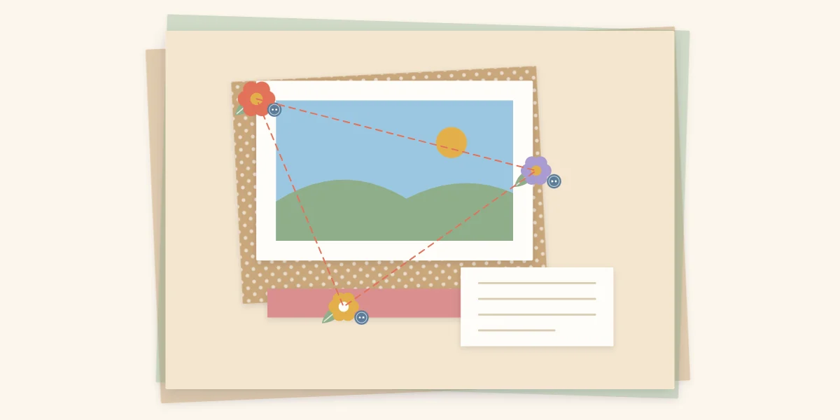
When the same color or type of embellishment appears three times, the eye connects the three points and travels around them. Arranging those points as a triangle around the focal photo keeps the viewer circling back to it instead of drifting off the edge of the page.
In practice, split your embellishments into three clusters of different sizes: a main one touching a corner of the photo, a medium one near the opposite side and a small one at the third point. An uneven triangle looks more natural than a perfectly regular one.
What going wrong looks like: clusters in a straight line, which divides the page, or pieces sprinkled evenly, which is one of the most common scrapbooking mistakes.
Leave white space on purpose
White space is any area of the page left empty. It does not have to be white; plain cardstock in any color counts. Its job is to separate the important elements from the edges and from one another, so each can be seen clearly.
Two habits protect it. First, keep a margin: a border of empty cardstock around the outer edge, even a narrow one, frames the whole layout. Second, group elements so the empty space collects in one or two larger areas instead of many thin slivers. A photo, its journaling and a cluster pushed together with small gaps form one unit, and the open cardstock beside them then reads as calm instead of unfinished.
Tip
If an empty area bothers you, wait before filling it. Step back from the table and look at the whole page. From a distance, open space usually looks intended; up close, it looks like something is missing.
Align edges so pieces look related
Alignment is what makes separate pieces look related. Line up the left edge of the journaling block with the left edge of a photo, or the top of the title with the top of a mat, and the page gains invisible lines that hold it together. Gaps that match each other do the same. The arrangements in photo layouts for one to six photos show how consistent gaps turn several prints into a single block.
Composition checks before gluing
| Principle | Question to ask | If the answer is no |
|---|---|---|
| Focal point | Is one photo clearly dominant? | Enlarge it, widen its mat or reduce a rival |
| Rule of thirds | Is the focal photo off-center on purpose? | Slide it toward one of the four intersections |
| Balance | Does the page feel level when you squint? | Move a dark or bright piece to the lighter side |
| Visual triangle | Do repeated pieces form three points? | Regroup them into three clusters of different sizes |
| White space | Is there a margin and one clear open area? | Pull elements together and remove a piece |
Frequently asked questions
What is the rule of thirds in scrapbooking?
It is a way of placing the focal photo off-center. Imagine the page divided into nine equal parts by two vertical and two horizontal lines; the four points where the lines cross are strong positions for the main photo. On a 12 x 12 in page those lines fall 4 in and 8 in from each edge.
What is a visual triangle on a scrapbook page?
It is three repeated elements, such as three embellishment clusters or three touches of one accent color, placed so they form a triangle around the focal photo. The eye links the three points and keeps moving around the photo instead of leaving the page.
How much white space should a scrapbook page have?
There is no set amount. Aim for a margin of empty cardstock around the outer edge and at least one larger open area, and group the photos, journaling and embellishments so the empty space is not broken into thin slivers.